1. In the first 5 seconds of our video there are shots of all of the band members getting ready to perform the song and this is quite common in music videos as it is one of the conventions that are in music videos, showing the audience the band getting ready by plugging in. One of the first people that we see is the drummer putting on the headphones and getting ready for the drum coverage, this could show that he enjoys playing the drums as he is quick and eager to get going.
shot 2
2. In this series of shots there is a shot of the band logo that is placed on the drums and this is a convention that is in all rock band music videos as it shows the audience who the band is and it is also a little form of identity. The logo is located on the drums as this is the most common place to put the logo and it is also most easily seen as the drums stand out in the background. I have also included some close ups of the logo on the drum set to allow the audience to focus on the logo.
shot 3
3. In this shot there is a high angle shot to show that the main singer is in charge and to emphasise that he is a big powerful person and this is a different to all of the other people in the band as the shots of them are mostly level and they are only high angle shots if they are in charge, this is another rock music video convention that I have followed as it shows the audience who is the main artist in the band and that he / she is the most important person in the band.
shot 4
4. In the video there is not an establishing shot, but this emphasises that the band just want to get on and start to play the song as they do not mess around and this shows that they have a passion for rock ‘n’ rolling, this is a convention for rock music as it is more focused on the stars and the playing of the instruments so there is no need for the narrative. The location of this video is obvious although there is not an establishing shot as the background is covered all wood and the most common wood building is either a shed or a log cabin and this is where the band performs the songs and it is just for making music, this is another convention as the location is given away without an establishing shot so therefore there is no need for one. Although this is not the most commonly noticed way of performing rock music it is still used as there is a dedicated room instead of a stage with thousands of people.
shot 5
5. Another way of showing that the band likes to play the music is shown as they are seeming to enjoy playing the song, this is because they are all showing their enthusiasm when they are bobbing up and down and dancing with the music, this is a convention that is used by all of the existing rock bands as it shows a passion that they have in playing the song and that nothing can take it from them.
shot 6
6. When we received our feedback of our group video, we were told that our narrative was not clear at all and that we had too many long shots, this meant that we would need to rethink about our storyboard and we also decided to choose a different location as the location that was previously chosen was not suitable for the genre of music that we had and finally we removed all of the narrative as this was the easiest and quickest option that we had, this meant that the conventions that we had broken e.g. the location and the narrative were corrected as we were then in a room for just performing and there was only performance in the video and this is a common rock video convention
shot 7
7. Our music video has narrative that applies to it as we have proven some of the theories that the theorists have made and one of the theories that our video has proven is by Sven E Carlson and his theory is that all music videos either have: performance, narrative or both in and the video that we have produced is all performance based, so this proves that Sven is correct, another theorist that we have proved to be correct is John and his theory is that a music video is like an advert a there are lots of close ups of the singer and band logo

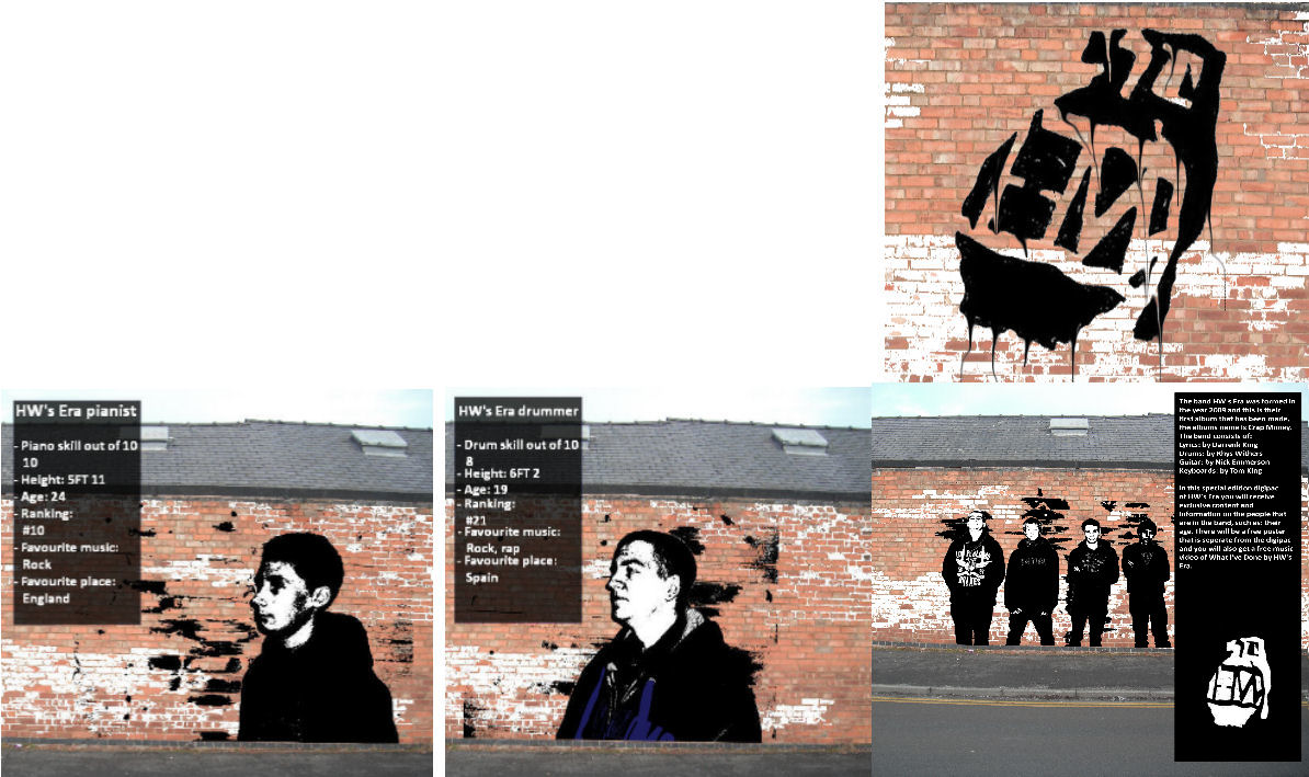
In my digipak I have made an effect that makes the images look like they were made by Banksy and this is an artist that goes around doing street art also known as graffiti. As the song that we were doing was of the rock genre I thought that it was appropriate that I make a digipak that was based on graffiti as this shows that there is a lot of miss behaviour and this is shown a lot in most of the rock bands e.g. Green Day
I chose to follow all of the conventions of a rock CD album apart from using dark colours as there is a building with bright brick walls in a street that I have broken this convention because I used the brick wall to show the audience that it is some sort of graffiti in the streets as there is a bright coloured building in the shot, I then followed all of the other conventions that almost all of the digipaks are formed around
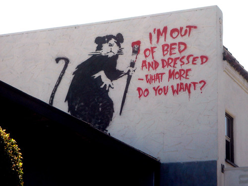
My digipak design was inspired by the images of Banksy’s artwork on street buildings that is further through the blog and they are images of the grim reaper, child with umbrella, monkey in a suit and a rat on a building painting (I got my main idea for the digipak cover from the rat painting of banksias work) here is a link to the picture of my inspirationhttp://farm1.static.flickr.com/86/232486050_5e9f669df8.jpg , other inspiration I hade was: Banksy art, graffiti, urban art and streets, from all of these inspirations I set out to make my digipak
I have used all of the shots in the digipak of the band and then there is a page for each of the band members and on them pages there is a list of their stats and this was inspired from the playing card game called top trumps and this was used in my digipack e.g. guitar skills: 8
I then had a page where there was a little information of the band and this was a single column that briefly described the band
Convention that I have applied / broken for the Digipak:
For my final version of the digipak I have followed the conventions for a rock digipak and here are what conventions that I have followed / broken:
1. the lead singer is the centre of attention - For this I have used a Banksy style of street art and I have positioned it so that it looks like the main singer (me) is painting the rest of the band on the wall although the main singer is a painting on the wall.
2. the colours that are used are dark and dull - For this I have edited the pictures so that they look like graffiti and that the colours they are is black and white, then the background is a picture of a brick wall and road.
3. the font of the text must suit the genre of music - For this I have used the font "Chiller" and this is a graffiti looking font so it fits in with the theme of the digipak, also it fits in with the genre of music because rock has a miss behaving effect to it, and miss behaving now is mainly graffiti
4. usually set at night time or in the streets - For this I have set the pictures in the streets as there is a brick wall just off the road and this is a street, although I have not set it at night time, because this would of effected the quality of the picture and it would be harder to see the text and images.
Poster
I have followed the effect that I have used for my digipak for my poster design and this is to make the effect that Banksy painted it on a wall, in this design I have included a series of the logo that are being carried by the main singer of the band and the inspiration for this design came from the image of three people with TV’s as their heads and here is a link to that picture: http://wallpampers.com/pictures/2679/Banksy-Banksy%20Urban%20Eyes.jpg , as the three people had the same head this gave me an idea to use a similar design but the people are carrying the objects instead of them being attached to them selves
I chose to break the convention of there being reviews on the poster as I thought that they would not be needed as they are just showing what somebody thinks of the new album and that people have different tastes to what they like e.g. rock, jazz ect... and therefore I decided not to use them
My poster design was inspired by the green day poster that is further through the blog and this is a drawing of a man walking, other inspiration I had was: Banksy art, graffiti, urban art and streets, from all of these inspirations I set out to make my digipak and poster
The text font idea that I have used in my poster design came from the image in the link: http://www.wallpaperbase.com/wallpapers/photography/graffiti/graffiti_3.jpg , as you can see in the image the font sticks out and it is quite hard to read at first, but then it becomes clear and this is the effect that I was aiming towards as it distorts the audience and it also follows the theme that I was aiming for of street graffiti/banksy effect.
Convention that I have applied / broken for the poster:
for my final version of my poster Ihave followed the conventions for a rock poster and here are what conventions that I have followed / broken:
1. the band logo is on the poster - For this I have applied four pictures of the logo being held by the main singer and all of this is in a Banksy style of art
2. the colours are dark and dull - For this I have used black and white for the images on the wall and there is then brighter colours in the background as there is brick work and reflections of the sky
3. the font must be easy to read - For this I don't think that the band name and album name is clear as it is supposed to be graffiti, therefore I have broken this convention to make the text follow suit with all of the graffiti pictures on the wall
No comments:
Post a Comment