Monday, 22 November 2010

logo colour designs

here are a few experiments with the different colours and designs of our band logo:

final decision on the band logo

I have been looking into all nine of the different colour designs that the logo that I have created can have and after looking at all of the different designs I thought that the best design to use would be the one that is in black and white as it is simple and plain colours... he reason I chose this colour scheme was because it would then fit perfectly into who genre of music our band will be performing.... here is a shot of the final logo:
now that we have a band logo you will now see shots of this somewhere in our video although we have not decided where to place it... I will be posting where we will be placing the band logo later on...

final logo decision for our band

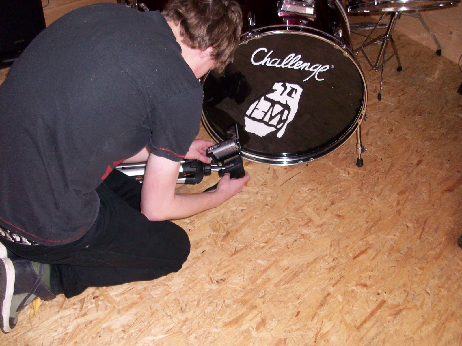
after thinking about what one of the five designs would be best for our band and also discussing it with Nick and Damon, I have concluded that we use the 3rd logo design as this looks more professional that the other four and it also looks the best as it is a simple design but it is really effective as it has the band initials, but they are not very clear so it also looks like a grenade and here is a screen shot of the logo:

logo design ideas

filming she-dual update

as we have not finished all of our filming we plan to film the rest of our film on Tuesday, 23rd of November and this will be the last time that we are filming.... after we have filmed we will start our editing of our music video.